
A geometric design can keep the eye moving even though every line stays exactly where it is. A triangle becomes part of a star, then a neighboring shape changes how the first one looks. Finding the repeat feels satisfying, particularly when it was hiding in plain sight a moment earlier.
With Geometric coloring pages, those relationships give each small decision a visible effect on the whole. Attention can stay with a single section or follow the arrangement outward until a larger structure emerges. There is no scene to interpret, just the absorbing business of noticing how one shape makes sense beside another.
Free Printable Geometric Coloring Pages
Click any coloring page below to open the PDF, then print on US Letter or A4 paper.
Did you find what you needed?
Help us choose what to create or improve next.
Coloring Ideas for Geometric Pages
Try one of these coloring ideas, or use them as a starting point for your own.
Design a Bird from Straight-Edged Pieces
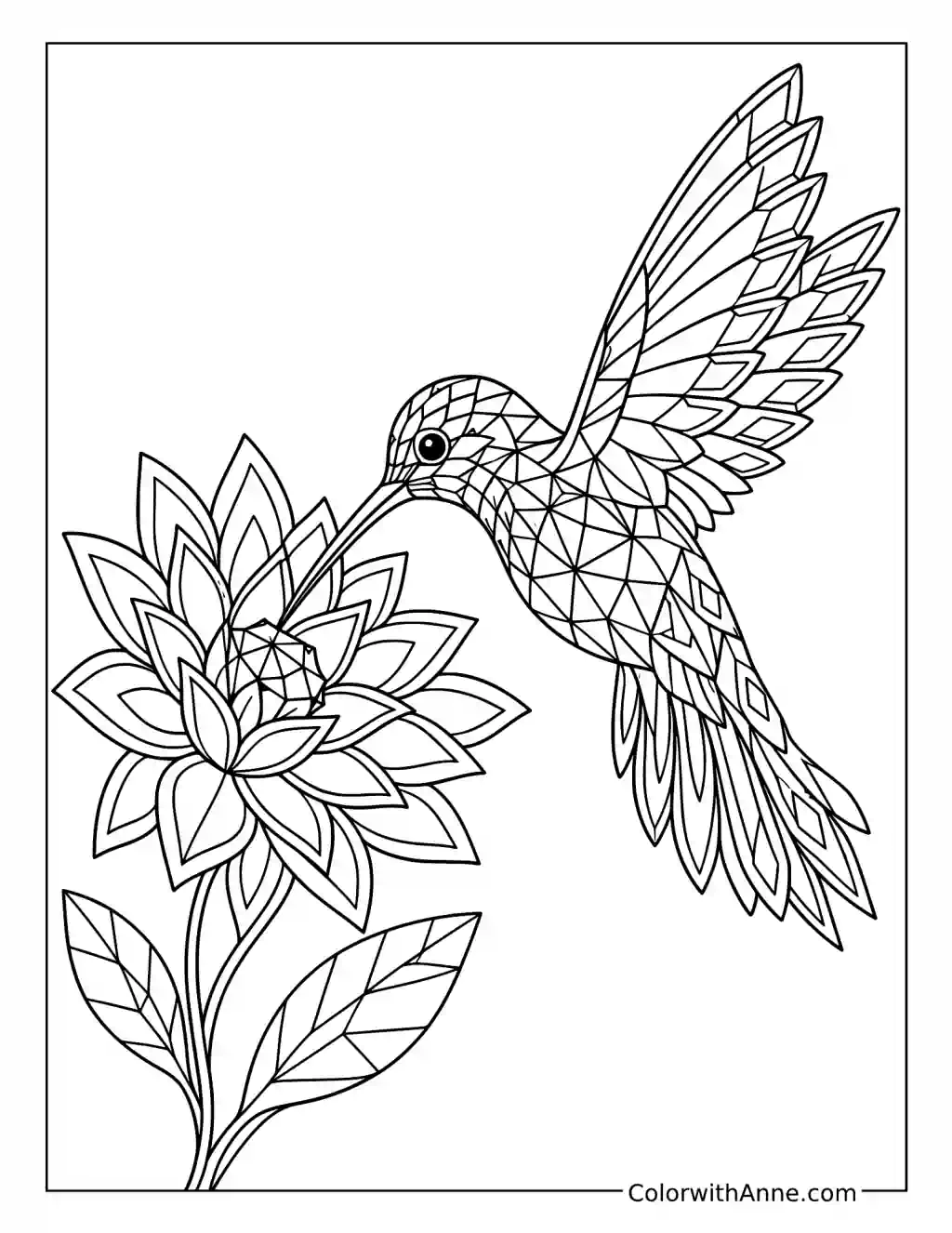
The hummingbird hovers beside a flower, its wings divided into narrow facets. The angular pieces still leave the bird recognizable, especially around the long beak and the sweep of its raised wings.
Emerald, teal, and blue would give the feathers a jewel-like finish. A warmer flower could provide a clear partner without needing every petal in a different shade.
Try creating another geometric bird on scrap paper. Begin with a simple outline, then divide only a few areas with straight lines. The useful challenge is choosing which features need to remain clear. A distinctive beak or tail can do more for recognition than covering the whole animal with tiny triangles.
Test the Spiral Without Its Colors
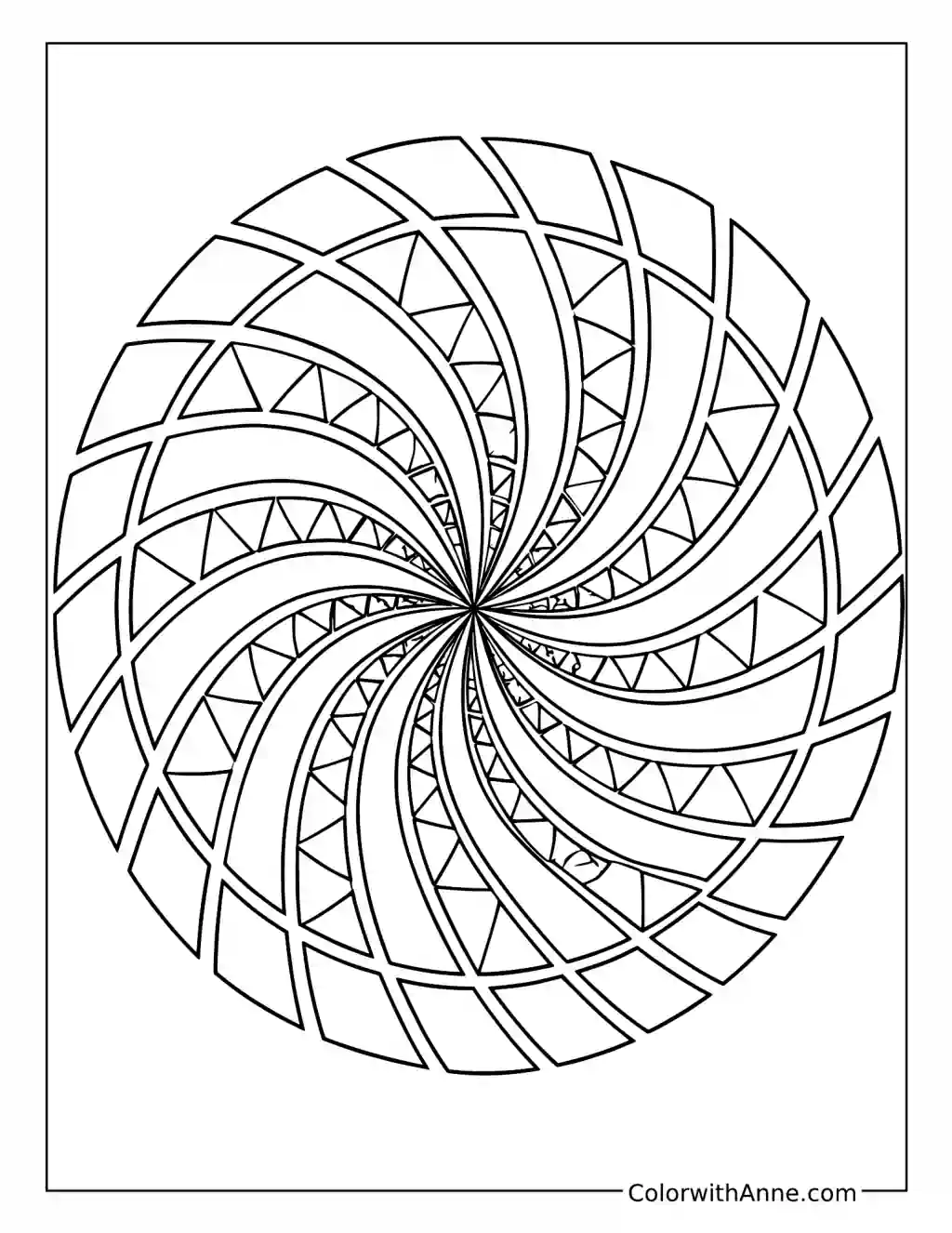
The spiral narrows toward its center through rows of angled shapes. Following one band all the way inward takes a little patience, particularly when neighboring sections seem determined to borrow its route.
Two strongly contrasting colors would make a good starting point. Black and cream are striking, while deep blue and pale yellow offer a softer alternative.
Photograph the finished design and view the image in black and white. See whether the spiral remains easy to follow when its hues disappear. This gives a useful clue about which colors are genuinely different in lightness, and can help explain why two bright shades sometimes merge more than expected.
Try Building the Impossible Cubes
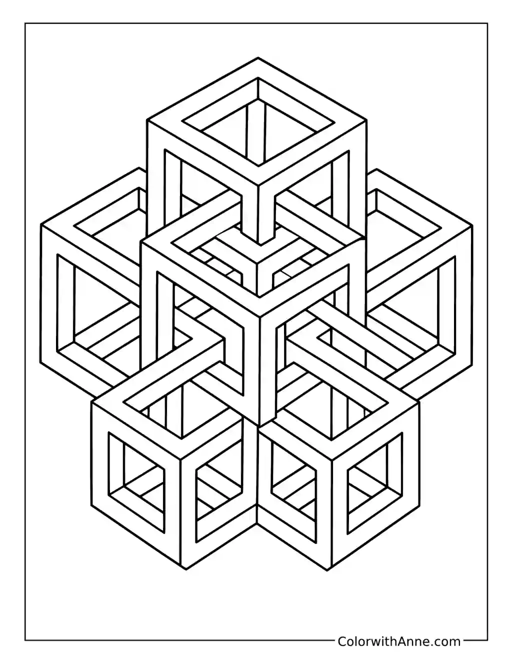
The open cubes interlock through a network of beams and corners. Each small part looks straightforward until the eye follows it into the next junction and starts reconsidering what is in front.
Three related shades could suggest the different faces of each beam. Keeping the lightest shade on similarly facing surfaces will help the structure feel solid at first glance.
Use building blocks to make an arrangement as close to the drawing as possible. When the model stops matching, look carefully at the junction responsible. Comparing the real pieces with the printed lines turns the illusion into something to investigate, especially when a beam seems to need two different positions at once.
Plan a Tile Before Decorating a Pot
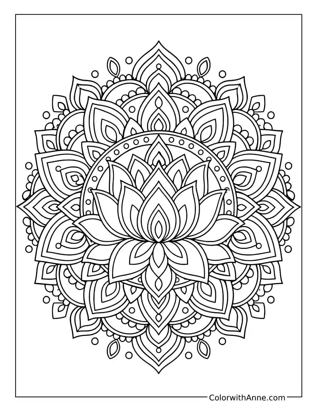
Stars and interlocking shapes repeat around the central design, creating the feeling of a small arrangement of decorated tiles. The pattern has plenty of detail, but its repeated shapes provide a comfortable rhythm.
Blue, turquoise, and white would give a crisp finish, with a little yellow in selected centers. Repeating the same choices around the design will preserve that tiled feeling.
Choose one small motif and redraw it as a border on separate paper. Work out how it turns a corner before using it to decorate a plain plant pot or another small object. Testing the repeat first makes it easier to spot where the spacing needs to change.
Play the Neighboring-Color Challenge
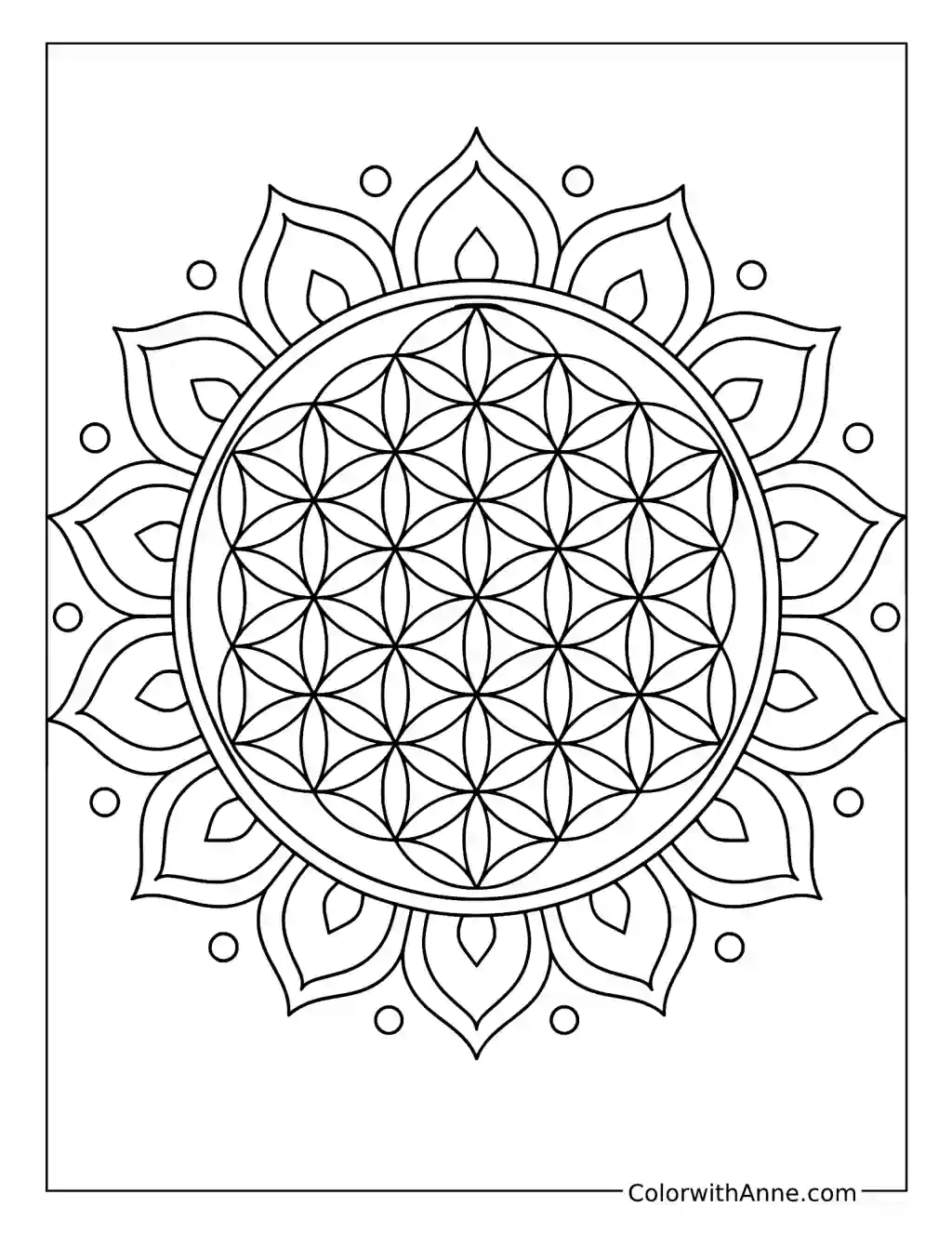
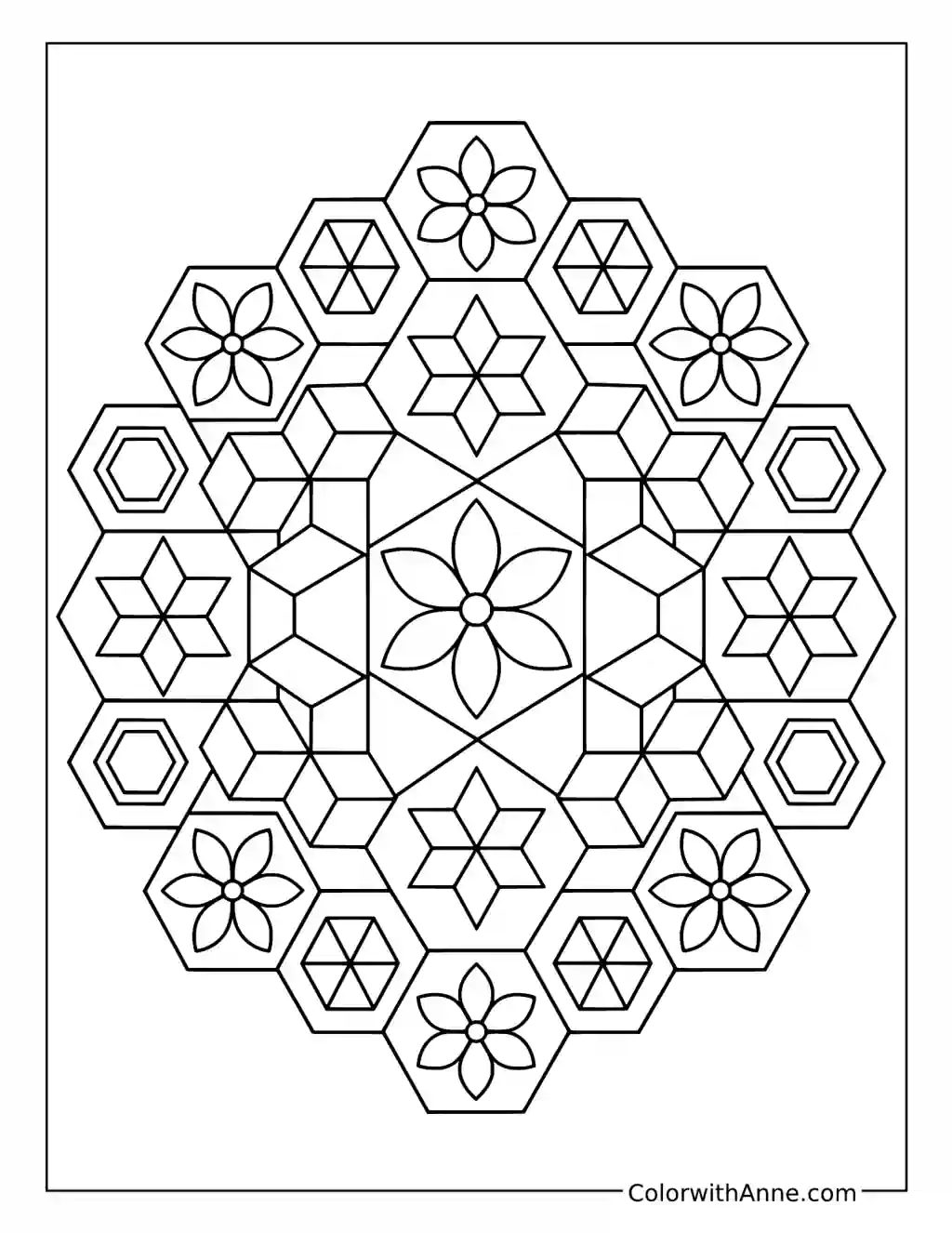
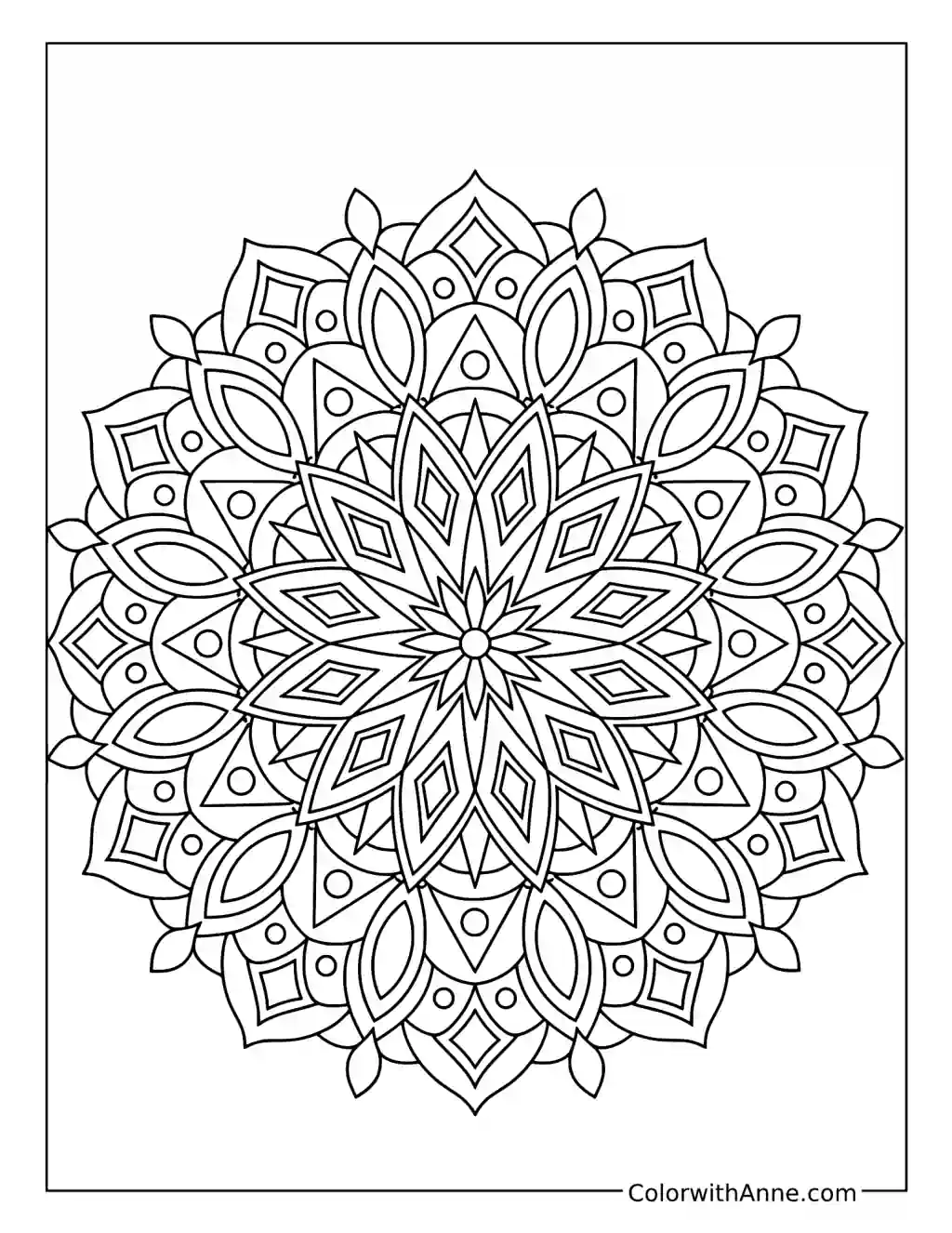
Hexagons fit together around the central flower, with smaller geometric details inside them. The arrangement offers a ready-made puzzle for anyone who enjoys giving a coloring session a clear little rule.
Choose three or four colors that are easy to distinguish. The flower details can stay within that palette, with lighter versions used where the spaces become smaller.
Try coloring the main hexagons so that shapes sharing an edge do not use the same color. Work through the arrangement gradually, checking the neighbors before committing. If one choice blocks the next, a small paper patch can cover the section while another solution is tested. The pleasure is in finding a pattern that satisfies the rule.
Wrap a Small Tin in Geometric Waves
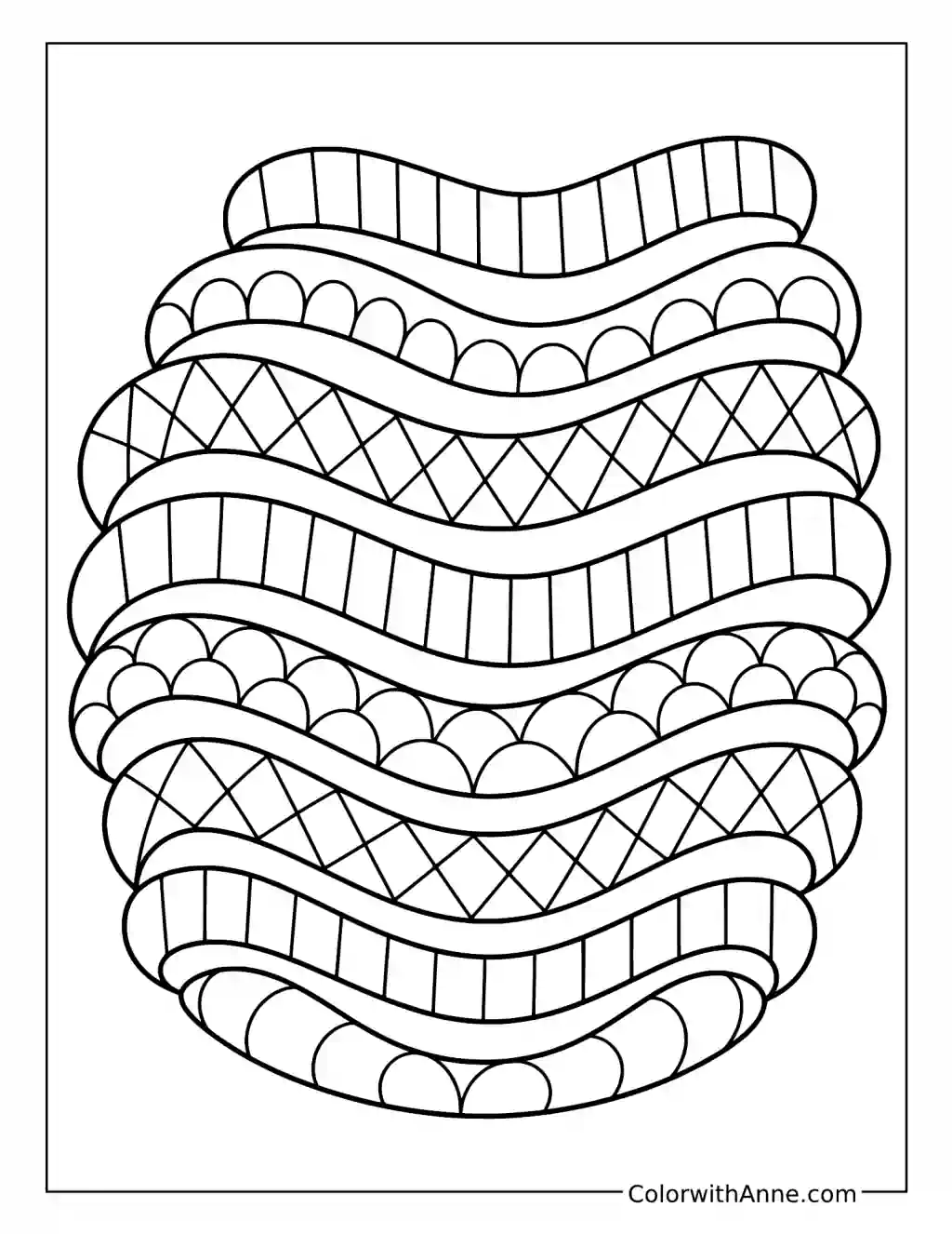
Broad waves stack above one another, with dots, diamonds, and divided bands filling their curves. The design feels particularly suited to a surface that continues around something.
A small palette of blue, green, and cream would connect the bands. One warmer stripe could interrupt the sequence in a deliberate, pleasing way.
A colored section can become a paper band around a clean tin or small box. Measure the height first and choose a strip that includes several different wave patterns. Wrap it loosely before trimming, checking where the ends meet. That join becomes part of the design, especially if two similar bands line up neatly around the back.
Use a Mirror on the Butterfly’s Wings
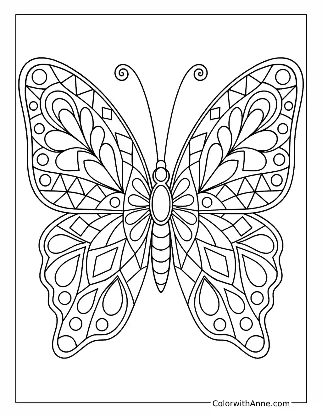
The butterfly’s wings contain repeated curves, narrow compartments, and small diamond shapes. The paired arrangement gives even an adventurous palette a clear structure to work within.
Purple, blue, and pink could move through the wings in repeated groups. Matching corresponding shapes on both sides would emphasize the symmetry.
Color one wing first, then hold a small mirror upright along the butterfly’s body. Its reflection offers a preview of a fully matched butterfly before the second side is finished. Try moving the mirror slightly and noticing which patterns join differently. It is a simple visual experiment that belongs naturally to this particular drawing.
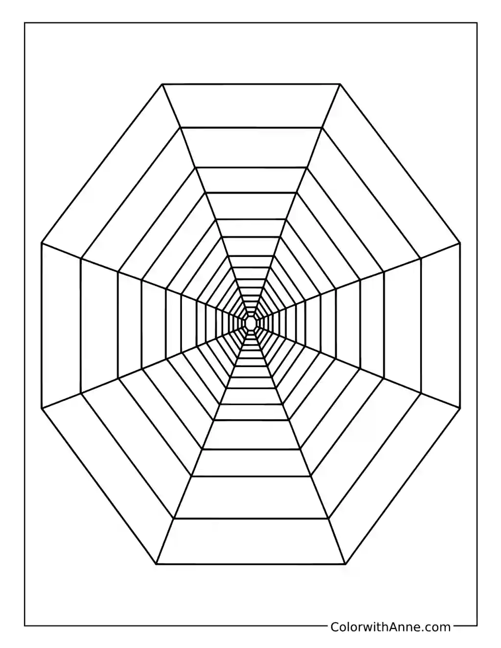
Find the View Down the Tunnel
The tunnel’s repeated frames shrink toward a tiny center, with long lines joining their corners. The open spaces begin to feel surprisingly deep once the eye settles on that distant point.
Alternating light and dark bands would give the tunnel a strong rhythm. A gradual shift from pale blue toward deeper navy could suggest another kind of depth.
Look down a hallway or photograph it from one end, then compare the edges with the lines on the page. Notice which familiar features seem closer together in the distance. Afterward, try drawing a simpler tunnel with only a few frames, using the printed version as a guide to how the corners connect.