
The lid clicks onto the cup, and the first warm sip makes the walk outside feel a little more manageable. At Starbucks, someone waits for a Frappuccino while another customer carries away a coffee that smells reassuringly strong. The green siren keeps watch over both versions of the morning.
Starbucks coloring pages bring that familiar coffee-shop atmosphere to a slower break at home. A favorite drink beside the paper can make an ordinary afternoon feel like a small appointment worth keeping. There is no queue to watch, although an iced drink may still leave its usual damp circle on the table.
Free Printable Starbucks Coloring Pages
Click any coloring page below to open the PDF, then print on US Letter or A4 paper.
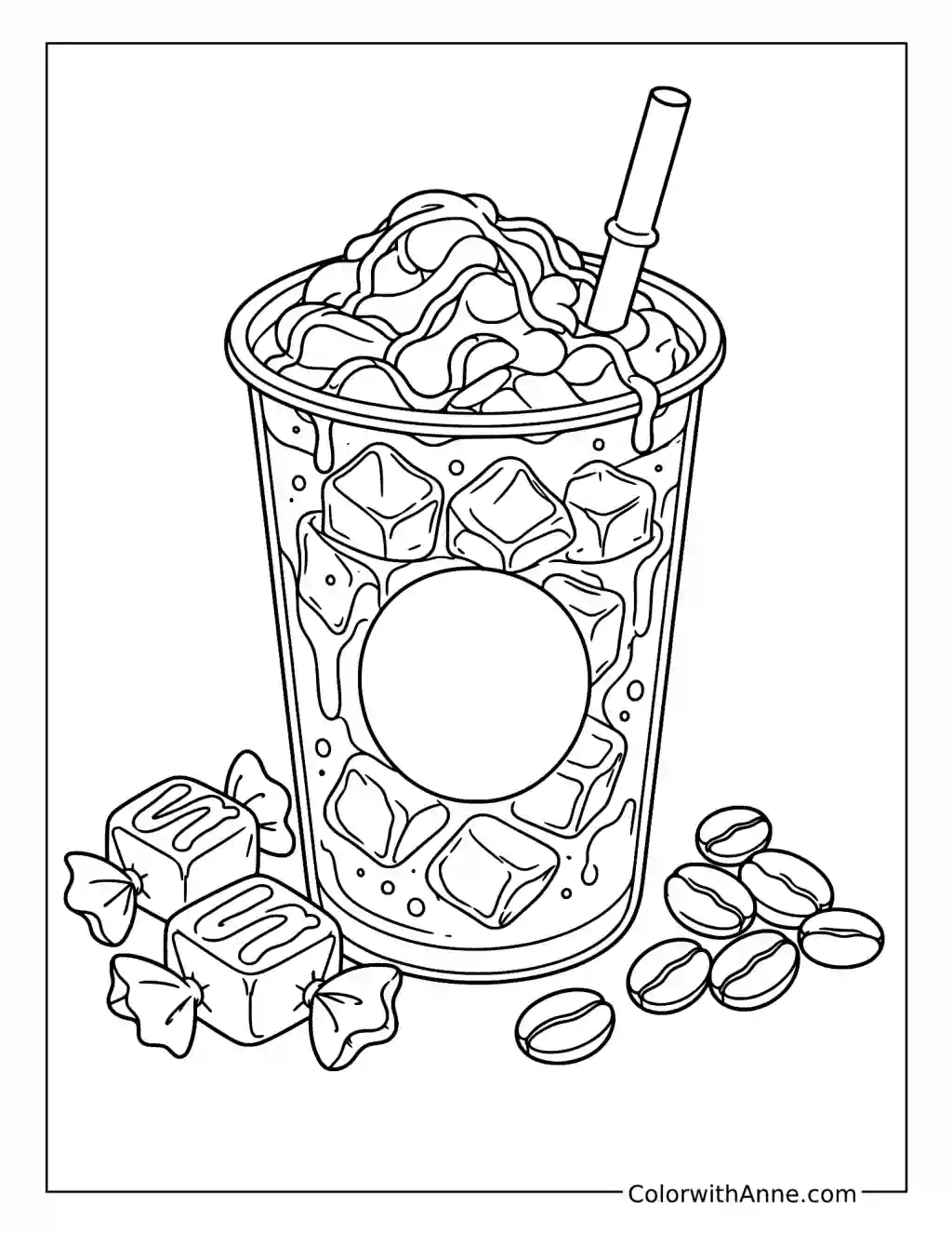
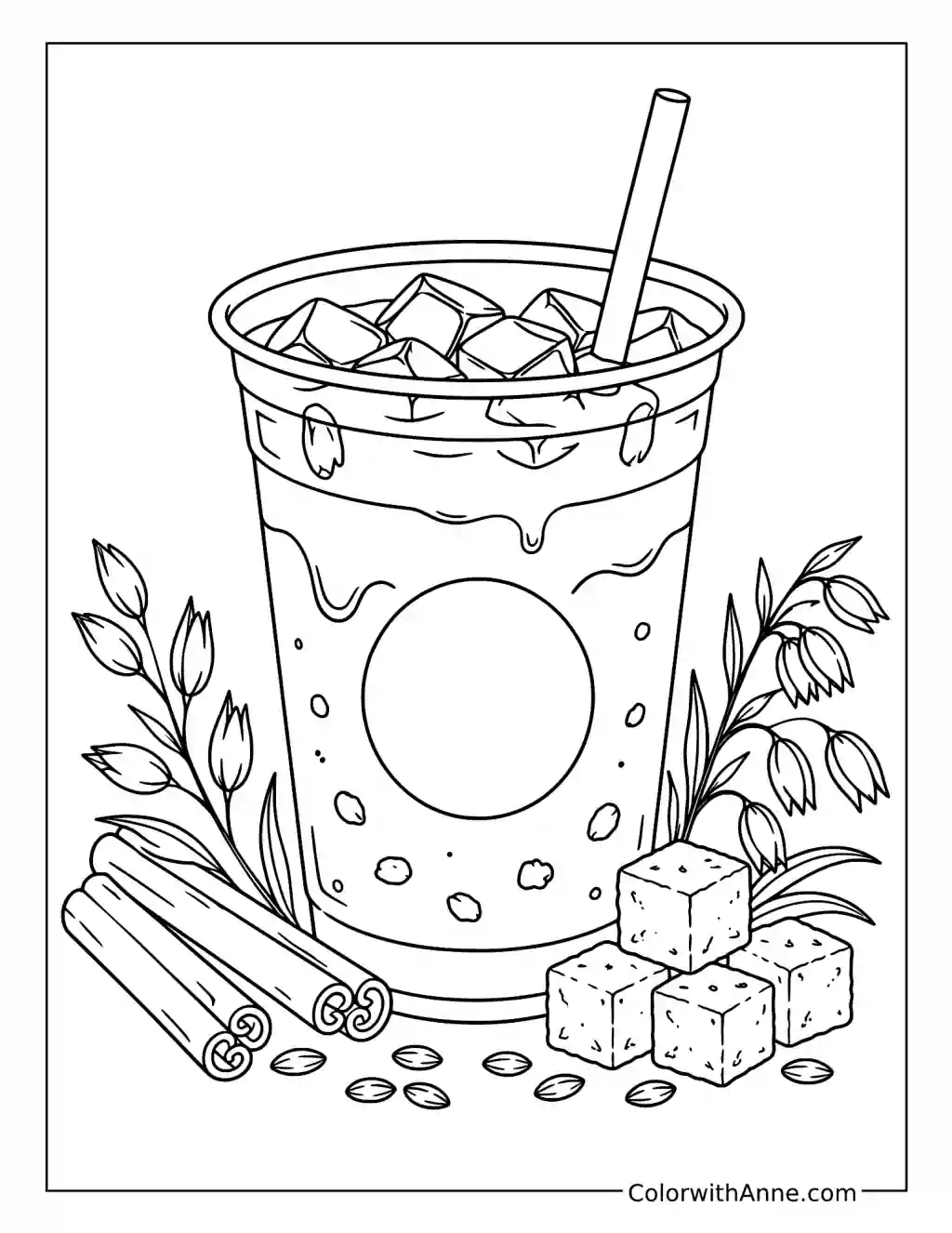
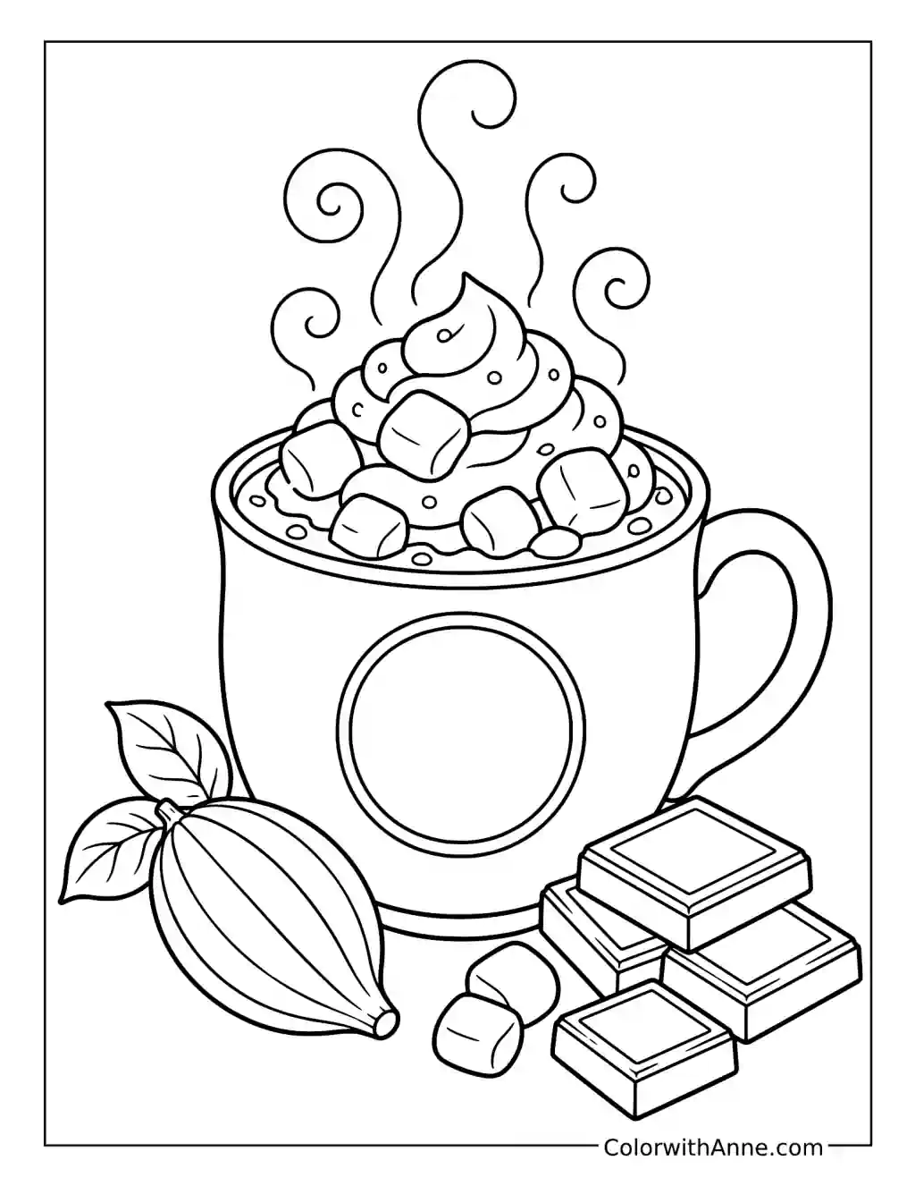
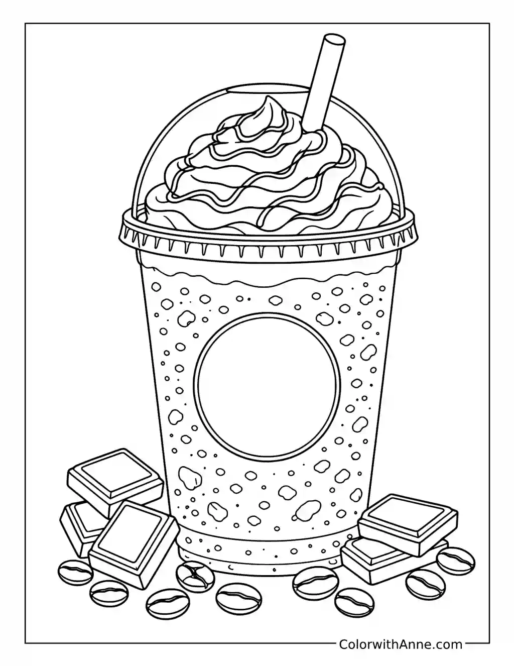
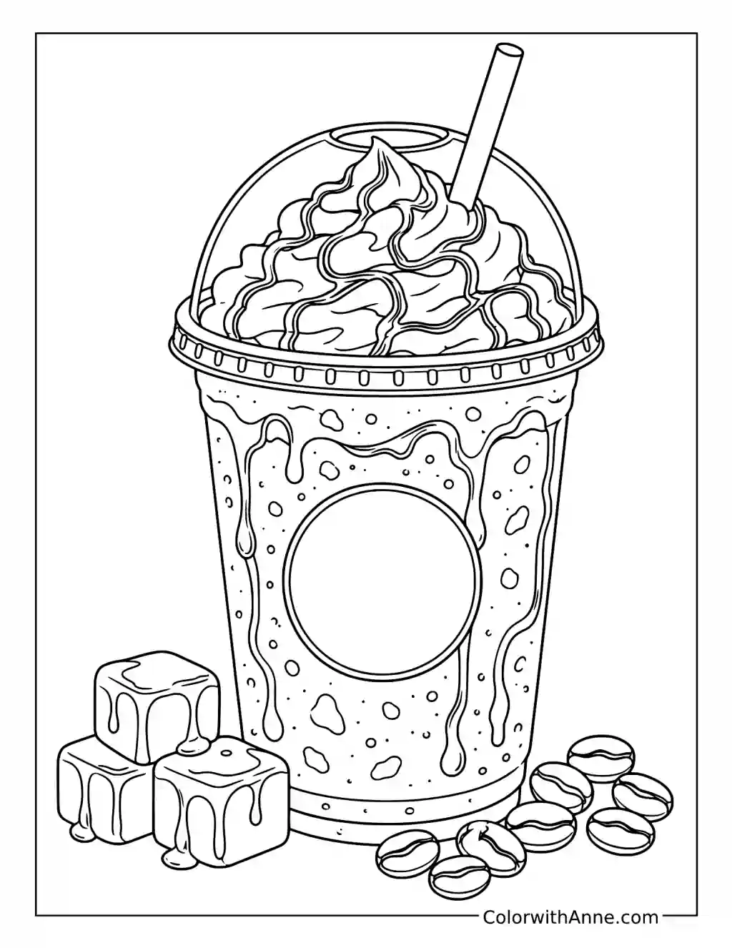
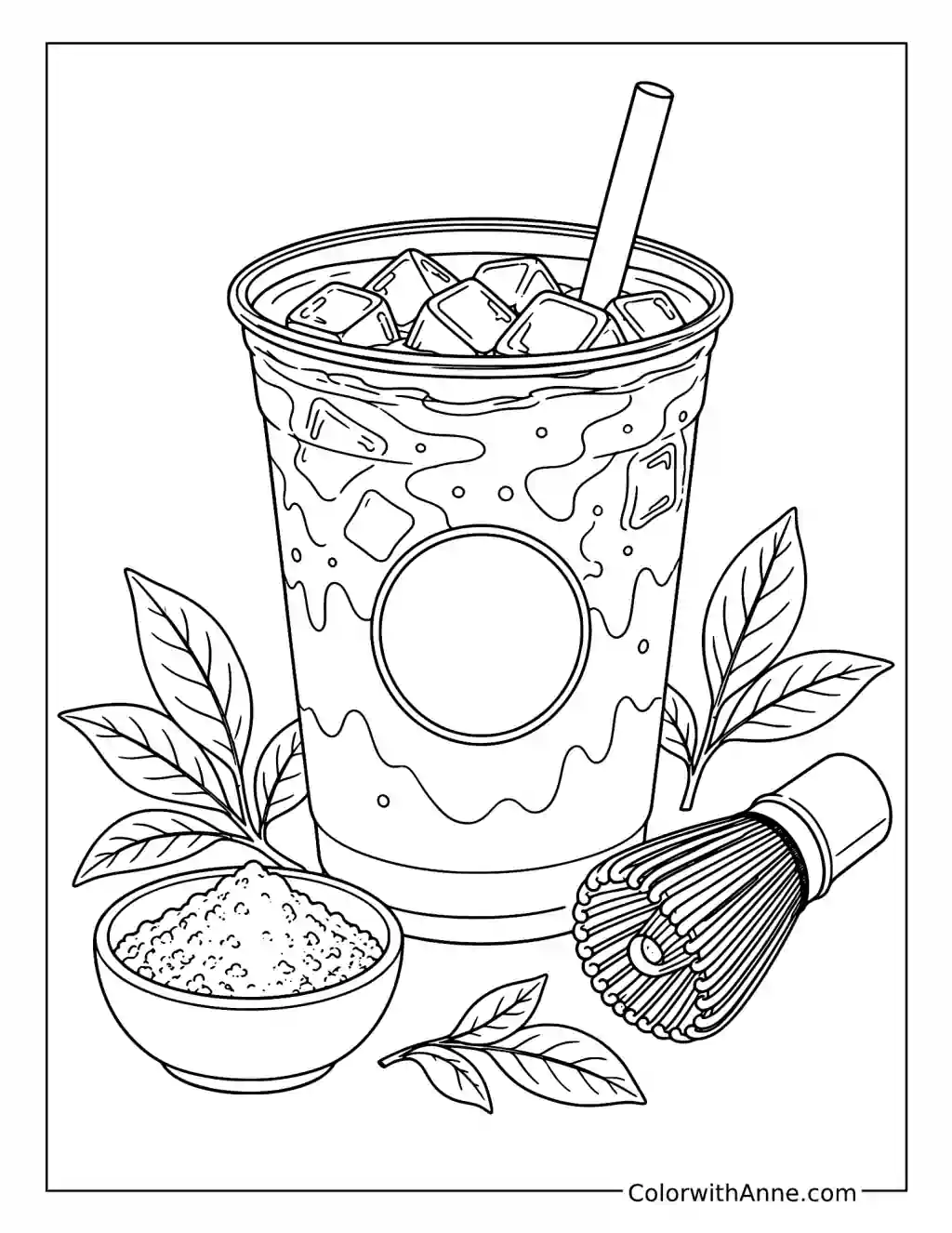
Did you find what you needed?
Help us choose what to create or improve next.
Coloring Ideas for Starbucks Pages
Try one of these coloring ideas, or use them as a starting point for your own.
Put Your Actual Order on the Cup
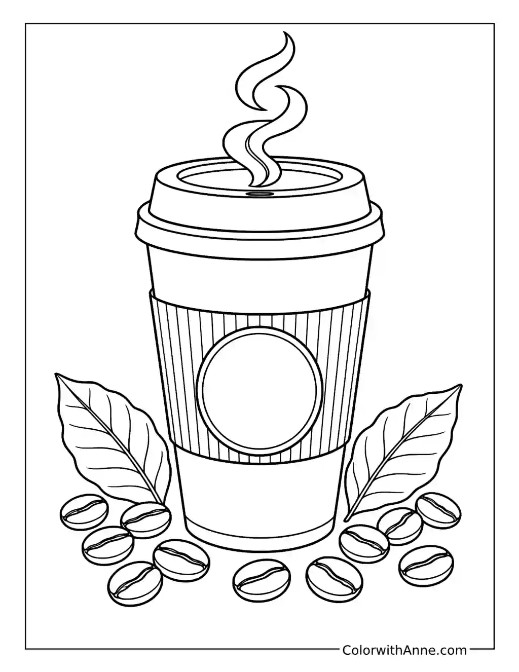
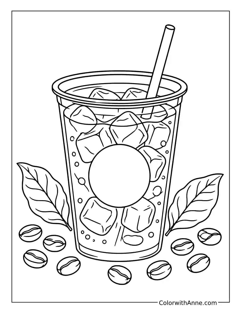
The hot cup has a broad sleeve and a blank circular badge, with coffee beans and leaves around it. That empty center is a fitting place for an order you genuinely enjoy.
Write the drink neatly inside the circle, keeping the sleeve’s texture distinct from the smooth lid. The finished page can sit near a home coffee station as a little personal menu. Unlike adding a name to every illustration, the wording here belongs to the cup and helps make an otherwise generic drink feel like your regular choice.
Watch the Cream Meet the Cold Brew
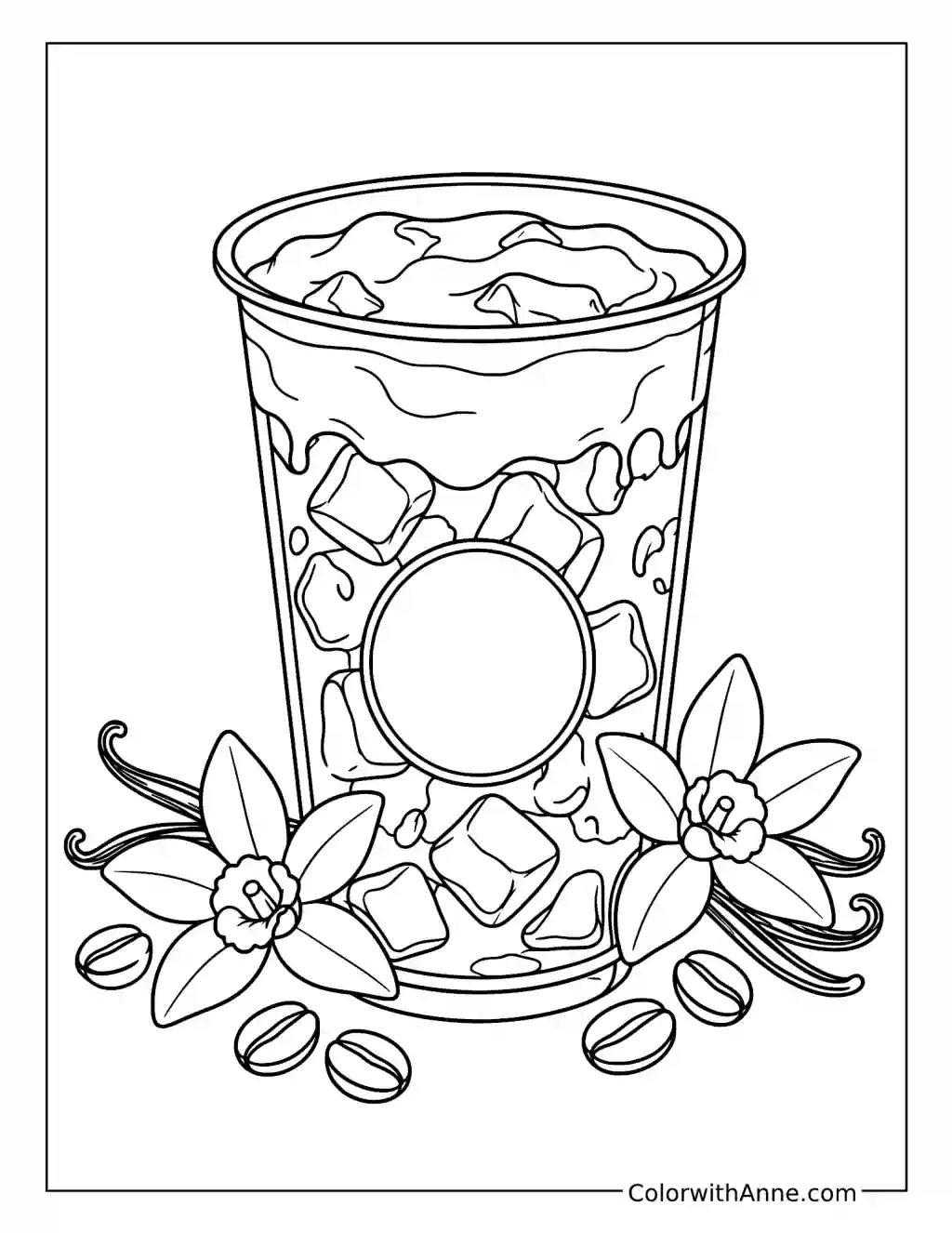
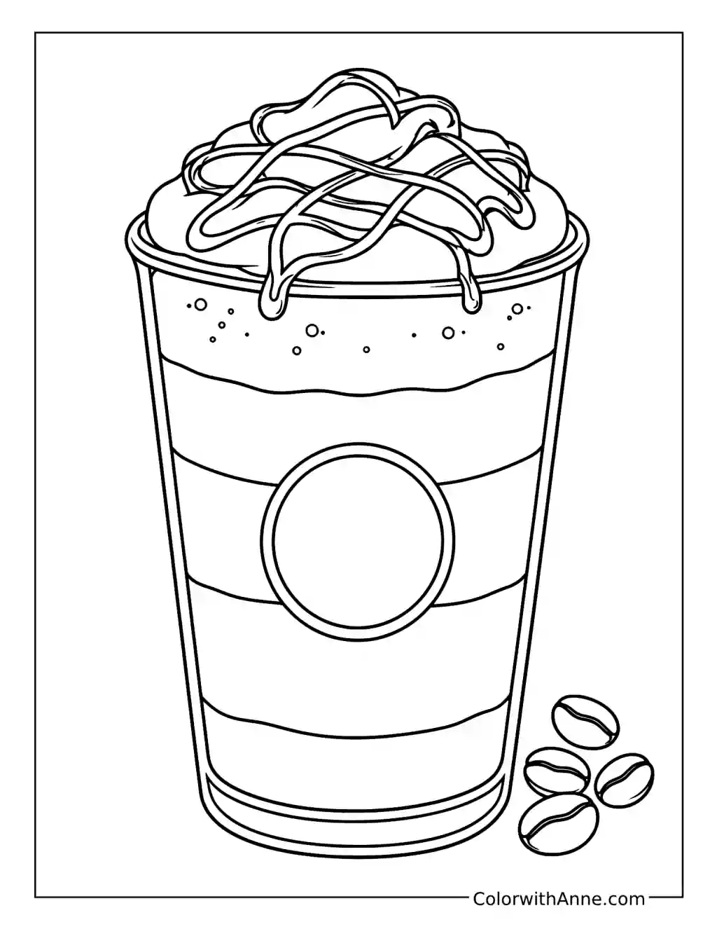
Cream curves through the upper part of the drink, with ice below and vanilla shapes around the cup. The interesting detail is the boundary where light and dark begin to mingle.
Leave the cream pale and let coffee tones gather around its curves. If you make a milky coffee at home, watch the first few seconds after adding the milk before stirring. Those soft trails offer a better reference than a cup that has already become one uniform color. The page catches that brief, satisfying stage.
Make a Berry Invitation to an Afternoon Break
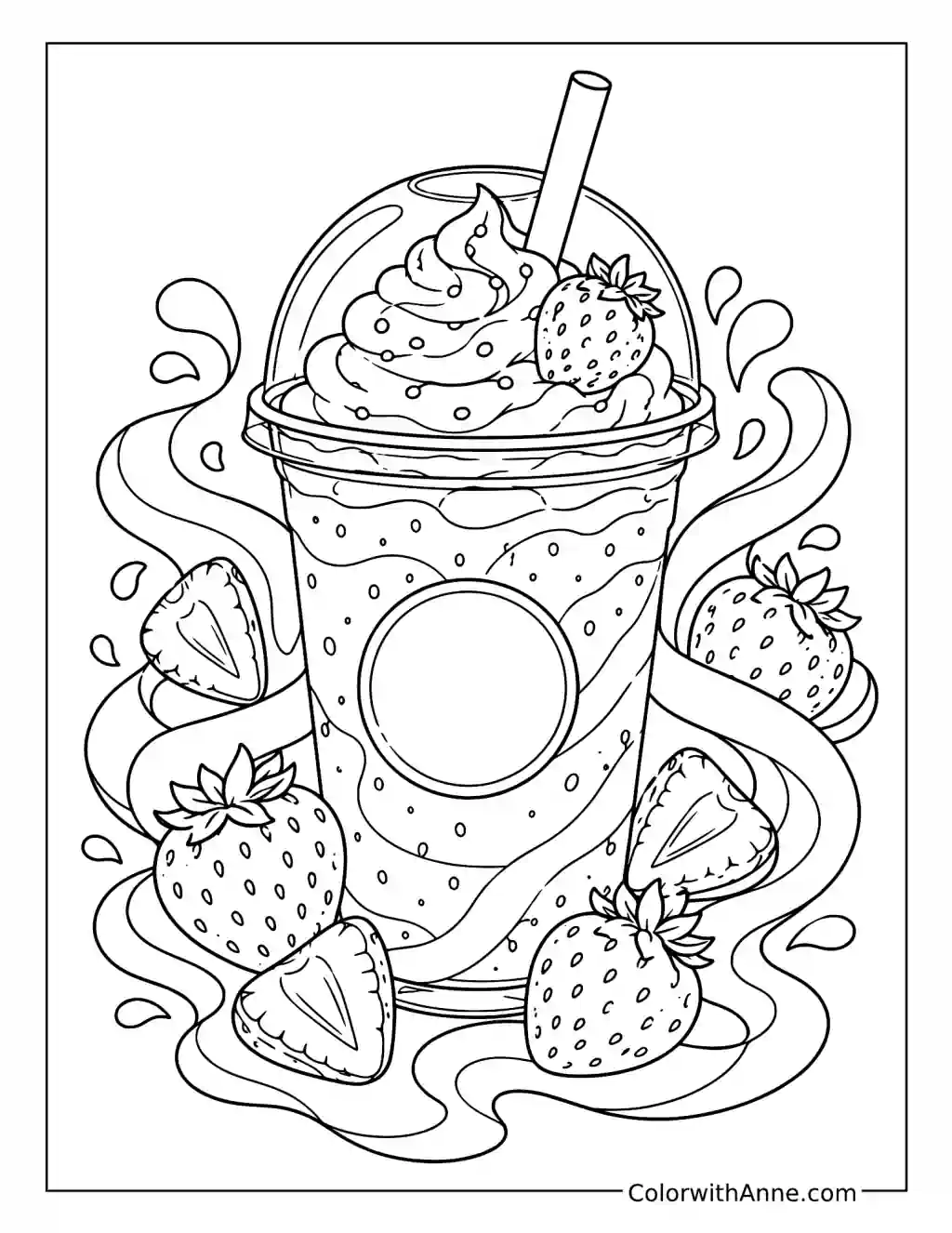
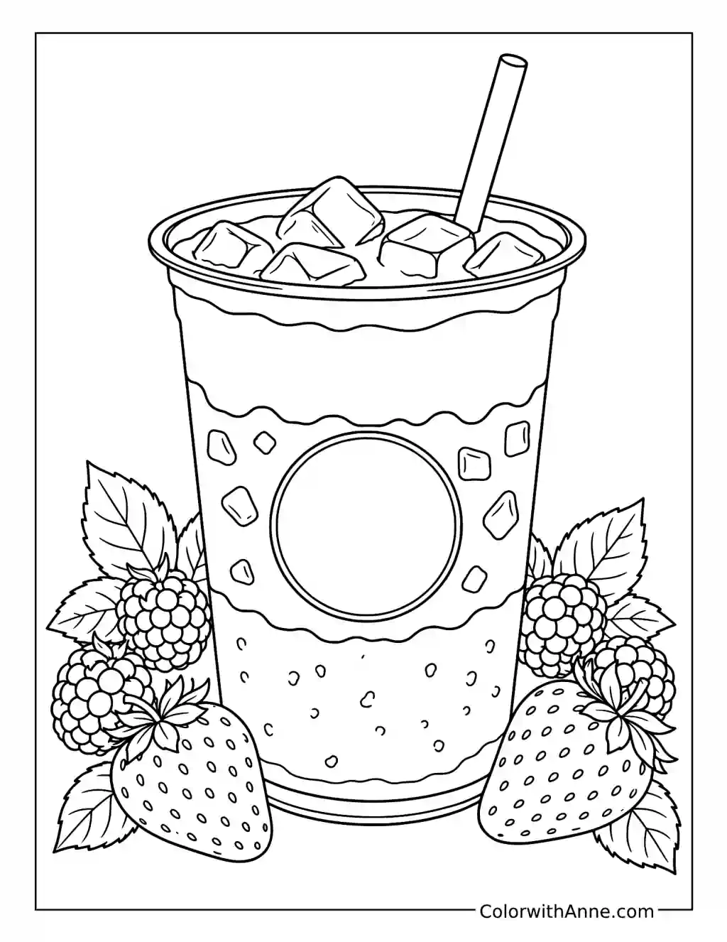
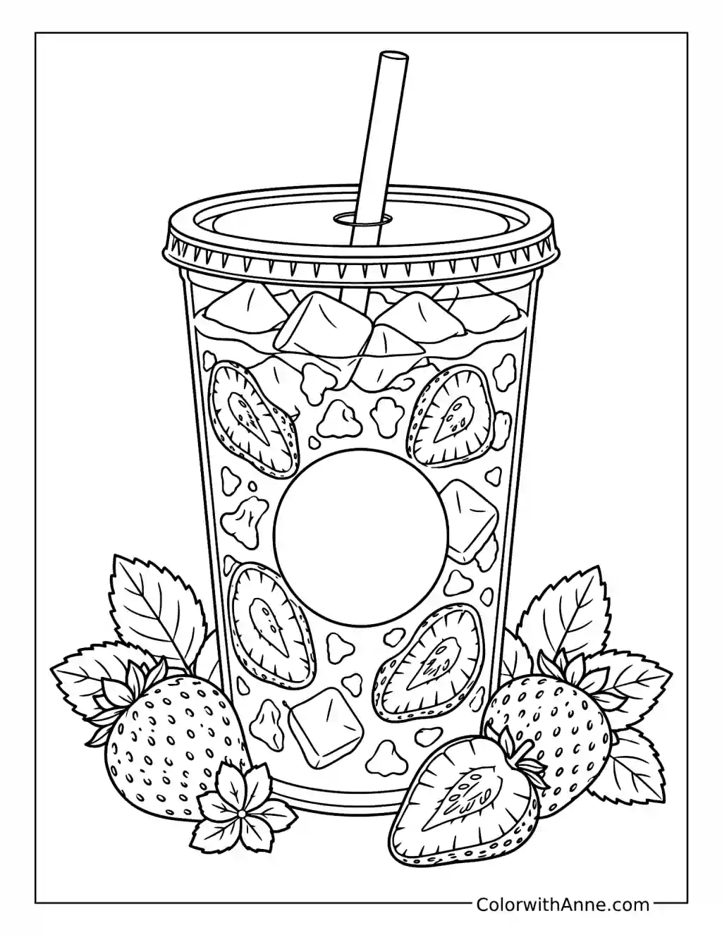
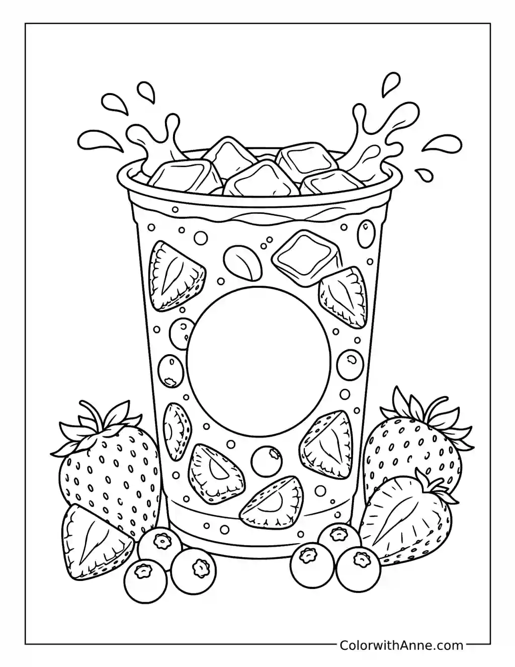
Whipped cream rises above the cup, with whole and sliced strawberries surrounding it. The picture has the abundance of a little treat planned rather than hurriedly grabbed.
Color it for someone you would like to invite for a coffee or sweet-drink break. A short invitation on the reverse is enough; the strawberry design handles the mood on the front. Keep the cream lighter than the fruit, with a few deeper pink details in the drink. It is a small reason to arrange the catch-up that keeps getting postponed.
Let the Fruit Supply the Summer Color
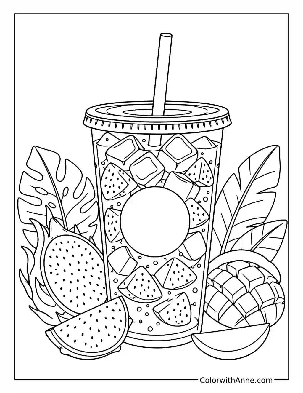
The cup is surrounded by mango and dragonfruit shapes, with cut pieces visible inside the drink. Their seeds, flesh, and peel provide several distinct surfaces.
Begin with the fruit outside the cup, where its color is easiest to understand, then carry related shades into the smaller pieces inside. Leave the ice lighter so it remains separate from the fruit. If those fruits are part of your kitchen, the page can inspire a simple fruit plate alongside a summer drink. The combination comes from the ingredients already surrounding the cup.
Pair the Cocoa Page with a Small Homemade Gift
The mug is piled with cream and marshmallows, with chocolate pieces beside it. This design naturally suits a warm-drink gift rather than another coffee order.
Color it as an enclosure with a jar or packet of your usual cocoa mix. Keep the marshmallows pale against the chocolate and let the steam remain light. Add the preparation instructions on the reverse if the mix needs them. The picture gives the gift its inviting face, while the practical information stays where the recipient can use it.
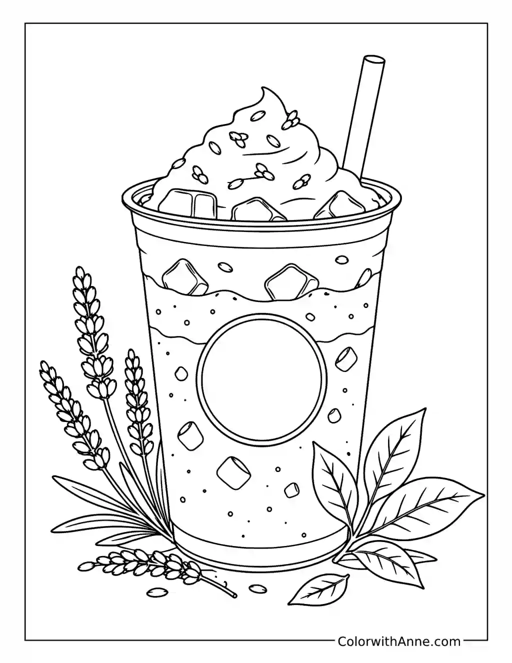
Keep the Lavender Cream Separate from the Matcha
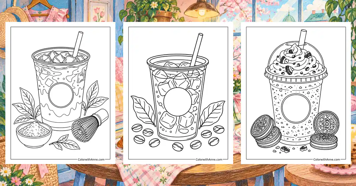
The tall cream topping sits above the drink, with lavender stems arranged around the cup. Green and violet can be appealing together, but they work best when each has a clear place.
Finish the topping and stems in related violet shades, then give the lower drink a softer green. Preserve a distinct boundary between them, with pale ice shapes interrupting the liquid. This page offers a compact color experiment: an unexpected pairing becomes convincing because the ingredients explain why the colors belong together.
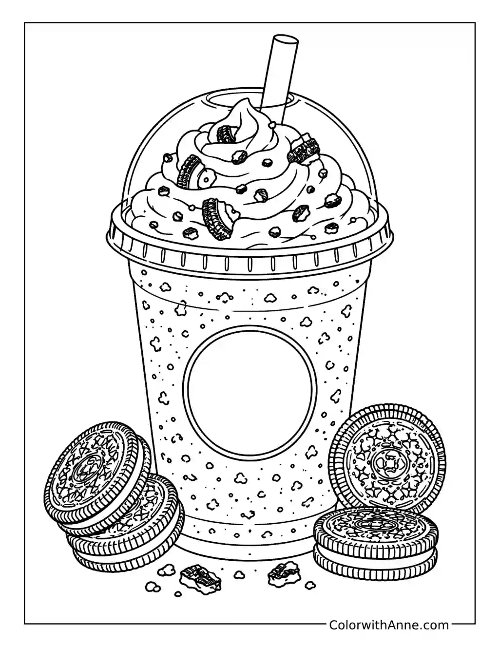
Make the Cookie Pieces Look Crumbled
Whole sandwich cookies frame the cup, while smaller pieces sit in the cream above. Their difference in size helps the topping feel textured.
Use stronger darks on the whole cookies and smaller, irregular marks in the cream. Keep some fragments softer than others so the topping does not become a row of identical dots. A real broken cookie on a plate can show how crumbs vary. It is a modest observation, but one that makes this particular drink look much more appetizing.
Plan a Gingerbread-Flavored Winter Break
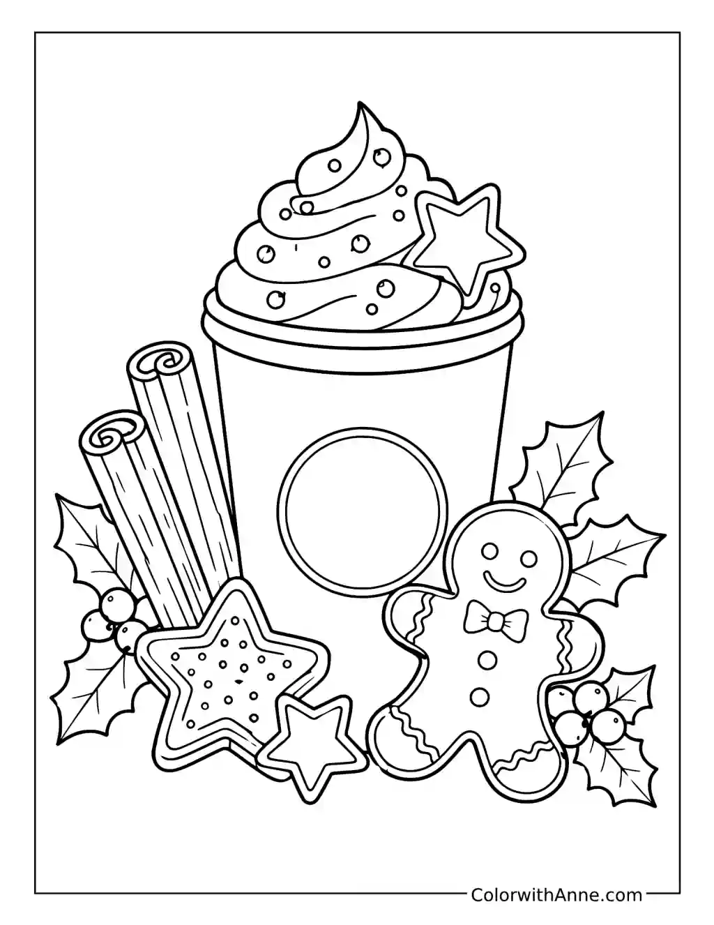
The latte is joined by a gingerbread figure, star-shaped biscuits, cinnamon sticks, and holly. The surrounding details make it feel like a seasonal pause with something on the plate as well as in the cup.
Choose the biscuit colors first, then let the drink and spices stay within the same warm family. This page can accompany a winter baking afternoon, with a drink ready while the biscuits cool. The little gingerbread figure supplies enough decoration that the finished picture needs very little added wording.